Now On Twitter!

posted by Joel Kimmel at
11:12 AM
![]()
Thursday, October 29, 2009Thursday, October 22, 20091970 NBA Champion New York Knicks
I received an email recently from someone who had followed my basketball player portrait work on SLAMonline. He was looking to commission a painting for his father's 50th birthday and wanted the piece to celebrate the New York Knicks' first NBA Championship in 1970 (prints available here).
 I wanted to paint this piece like an old boxing poster and feature the two Knicks stars, Willis Reed and Walt Frazier. Willis was hobbled with a torn muscle in his leg and sat out the previous game against the Lakers but made a surprising and inspirational return to the court in Game 7, helping to elevate the Knicks to the victory and their first championship. I wanted to paint this piece like an old boxing poster and feature the two Knicks stars, Willis Reed and Walt Frazier. Willis was hobbled with a torn muscle in his leg and sat out the previous game against the Lakers but made a surprising and inspirational return to the court in Game 7, helping to elevate the Knicks to the victory and their first championship. Above are a few process shots from start to finish. I stained the paper after masking out the area where the figures would be. I wanted the whites of the jerseys to really pop and didn't want them to match the tonal background color. Above are a few process shots from start to finish. I stained the paper after masking out the area where the figures would be. I wanted the whites of the jerseys to really pop and didn't want them to match the tonal background color.Getting the ellipses of Madison Square Garden's famous ceiling was tricky. It involved a lot of measuring and compass work.  I added the text by using a photocopy transfer method. I scanned the painting and arranged the text digitally in Photoshop to get the size and placement how I wanted it. I added the text by using a photocopy transfer method. I scanned the painting and arranged the text digitally in Photoshop to get the size and placement how I wanted it.I then reversed the text, printed it on my desktop printer and then used a photocopier to make a copy of the printout. That step is important because the printer ink doesn't transfer with this method, you need to have a printout with photocopy toner in it. I used a lightbox to place the printout exactly on the painting and taped it down with masking tape. Then I used a Chartpak blender marker (after opening some windows first, that thing stinks) to go over each letter, one at a time, and used a burnishing tool to rub the toner off the copy and transfer the letters onto the painting. It takes a bit of practice to figure out how wet the paper needs to be from the marker. Too much of it will give the letters fuzzy edges. I watched this Finals game on DVD to get an idea of how the game went to see if there was anything I could use for the painting. I was really impressed with some of the players (especially Walt Frazier), and watching the old game shows how different it is from today. This NBA season marks the 40th anniversary since the Knicks' first championship. You can buy a print of this painting in my shop!
posted by Joel Kimmel at
11:30 AM
Wednesday, October 14, 2009Letterpress Promotional Cards
I just sent out a batch of new promotional postcards and decided to include a letterpressed card of my drawing of the Sudbury water tower. I drew this piece a few months ago (you can read about it here) and thought it would look great printed with the press.
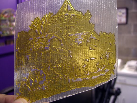 The first step was to scan the drawing at about 1200 dpi and clean up the lines a bit. I then sent the drawing off to Boxcar Press for them to create the photopolymer plate (above) needed to make the print on the press. The amount of detail in the plate is really amazing. The small crosshatched lines are almost invisible on the plate unless you tilt it into the proper light. The first step was to scan the drawing at about 1200 dpi and clean up the lines a bit. I then sent the drawing off to Boxcar Press for them to create the photopolymer plate (above) needed to make the print on the press. The amount of detail in the plate is really amazing. The small crosshatched lines are almost invisible on the plate unless you tilt it into the proper light.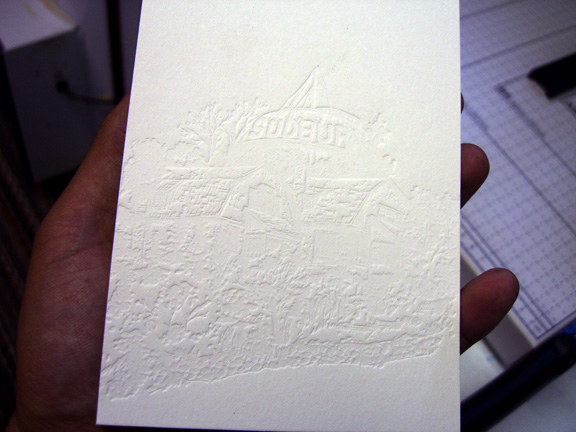 I made a print without any ink (called blind printing) and it gives a really nice appearance. Once I had the press set up with ink, the gauge pins set and the paper registered, (some pure black mixed with a bit of red) I was ready to start printing. I made a print without any ink (called blind printing) and it gives a really nice appearance. Once I had the press set up with ink, the gauge pins set and the paper registered, (some pure black mixed with a bit of red) I was ready to start printing.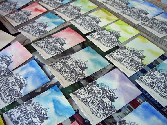 I printed 200 cards but about 7 of them were over-inked or fell under the press into the oily puddles below (a lot of oil is required to keep Claudette, our press, running smoothly). With those cards lost, I ended up with a limited edition of 193 cards. I signed and numbered them all, but the most time consuming part of all was laying down washes on each card to give them a colorful sky to contrast with the black ink. Here's a shot (above) of a bunch of them laying out to dry. 193 of these things, that took a while. I printed 200 cards but about 7 of them were over-inked or fell under the press into the oily puddles below (a lot of oil is required to keep Claudette, our press, running smoothly). With those cards lost, I ended up with a limited edition of 193 cards. I signed and numbered them all, but the most time consuming part of all was laying down washes on each card to give them a colorful sky to contrast with the black ink. Here's a shot (above) of a bunch of them laying out to dry. 193 of these things, that took a while.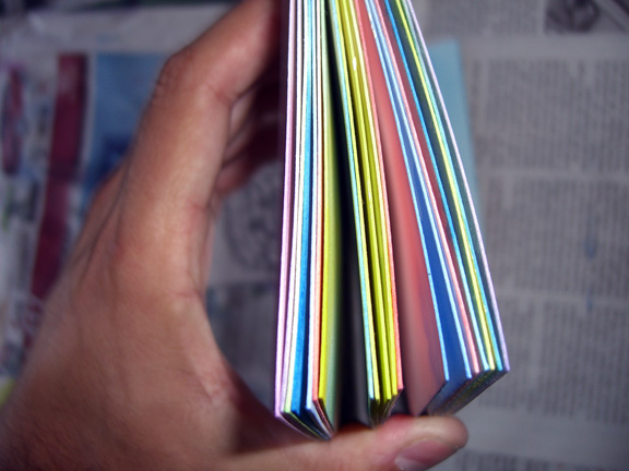 I really put down a lot of water on these cards and the colors bled over the tops to give an appearance of edge painting. I used Crane Lettra 110 lb paper for this project and they turned out great, even though it's not the best paper for watercolor painting. I'm looking forward to doing more promo cards on the letterpress. I really put down a lot of water on these cards and the colors bled over the tops to give an appearance of edge painting. I used Crane Lettra 110 lb paper for this project and they turned out great, even though it's not the best paper for watercolor painting. I'm looking forward to doing more promo cards on the letterpress.I also letterpressed the envelopes. I figure I have this giant machine in the basement I may as well use it. Sure, I could have printed labels on my ink jet, but where's the fun in that. The fox illustration is from the cover I did for Las Vegas City Life (see post).  For some more fun letterpress stuff, visit Papillon Press. For some more fun letterpress stuff, visit Papillon Press.Also, if you're an illustrator and want your postcards printed on a letterpress, we can do that for you. Contact Papillon Press for more info.
posted by Joel Kimmel at
4:00 PM
Monday, October 5, 2009Maisonneuve - Blogger Portraits
I've always wanted to do a series of portraits for a publication and got my chance for the current issue of Maisonneuve. These guys are prominent in the online media/blogging world.
The portraits are a mixture of watercolor, India ink and technical pen. 
posted by Joel Kimmel at
1:20 PM
Thursday, October 1, 2009Maisonneuve - Cover Illustrations Part 2
The current issue of Maisonneuve has a few of my illustrations on their cover (see previous post). The new issue deals with the publishing industry - the death of newspapers and the emergence of web media, blogging, etc...
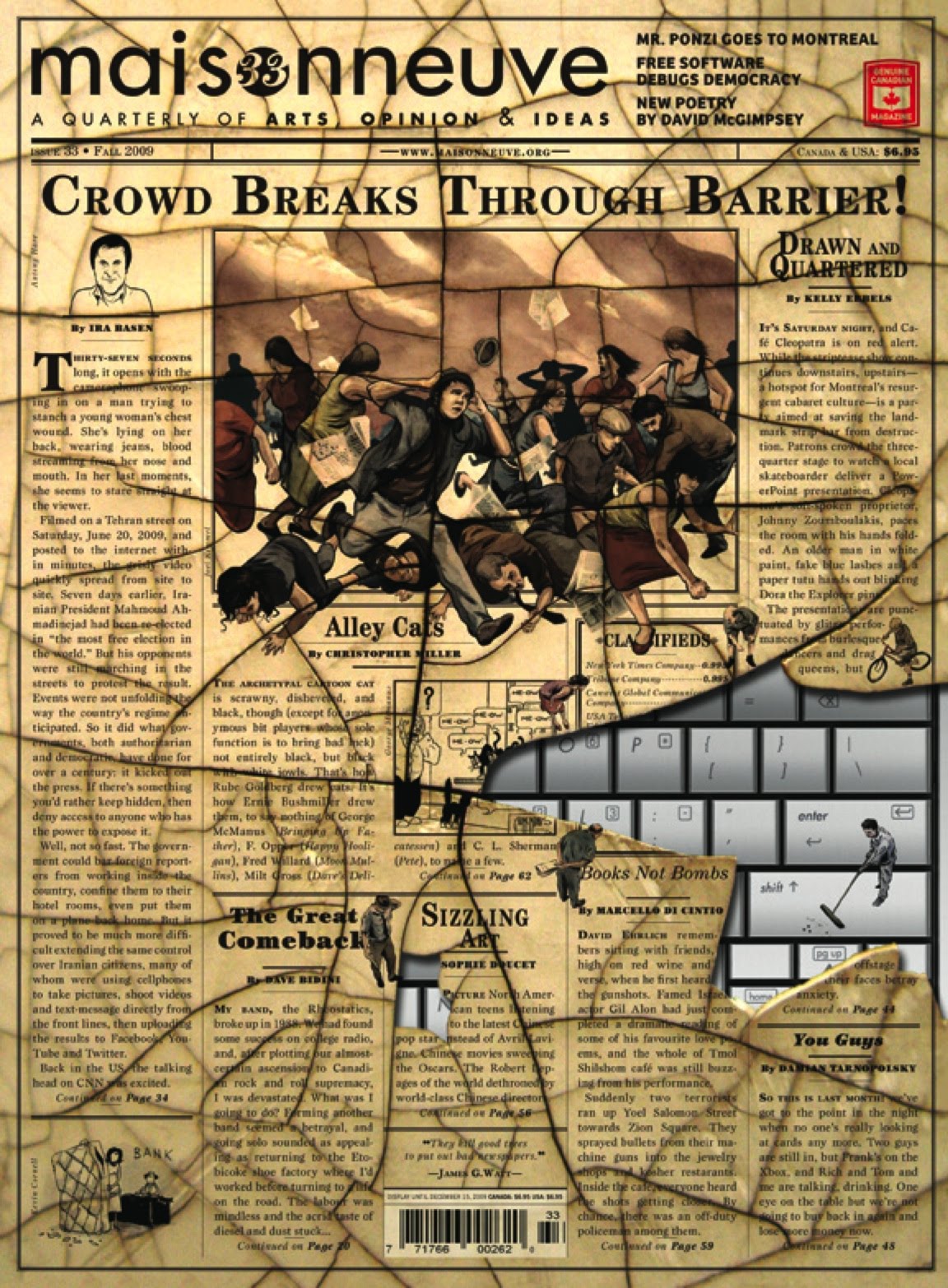 These small characters were added to the cover design to appear as though they're looking down towards the keyboard from the broken surface of a newspaper. These small characters were added to the cover design to appear as though they're looking down towards the keyboard from the broken surface of a newspaper.  I had a great time drawing these figures. They were originally meant to be black and white, but a late change required them to be in color. I like how both sets of figures turned out and I hope to do more of this sort of thing again sometime. I had a great time drawing these figures. They were originally meant to be black and white, but a late change required them to be in color. I like how both sets of figures turned out and I hope to do more of this sort of thing again sometime.
posted by Joel Kimmel at
10:00 AM
ABOUT ME
E-mail Me. SUBSCRIBE
To be notified of updates to my blog, subscribe to my news feed by clicking the button above or add my feed to one of the feed readers below.
Select Client List
Links
Previous Posts
Archives
|
